Whimbrels and Scrollytelling
What the Heck is a Whimbrel?
Some of you may know that a whimbrel is a kind of bird - specifically, a small migratory curlew of the northern hemisphere.
But at Story Inc, "whimbrel" has come to mean something different - a narrative touchscreen experience which can be scrolled through like a webpage and supports multimedia and multilingual content. That name came from a New York Times article of that type (about the bird whimbrels). The more official name, we've since learned, is "scrollytelling". Google "NYT whimbrel" to access the story (or find it, paywalled, at www.nytimes.com)
This year, we've been lucky enough to have a team helping us think about how to make better whimbrels. We've hosted a group of graduates from Victoria University's Masters of UX Design Capstone project as interns: Alina, Eva, Clara, Kayla and Kyla.
As a part of their final Masters project the "Capstoners" researched, user tested, and thought of further refinements for the whimbrels we made for Te Whare Hononga in Ngāmotu - New Plymouth.
The ‘whimbrels’ made at Te Whare Hononga were used to tell 4 complicated stories about Ngāti te Whiti iwi and St Mary’s Church.
We had learnt a lot from these initial whimbrels, but we weren’t sure how they would move forward as a permanent fixture of our practice. Queue the Capstoners!
Research
The Capstoners first embarked on extensive foundational research - observing visitors at Te Papa, conducting usability testing on the existing whimbrels, running stakeholder interviews, and undertaking desk research.
Their research unearthed many interesting tidbits such as:
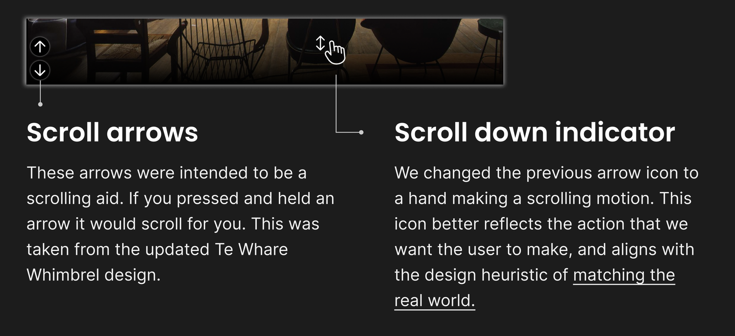
Children like to use touchscreens as if they were ipads, while adults prefer to use them like computers with scroll bars.
People spend more time interacting with touchscreens if there is a chair in front of it.
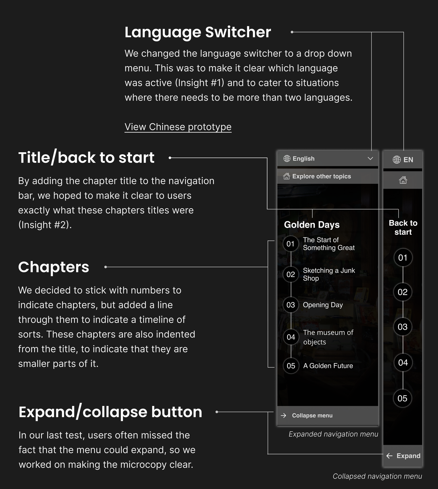
Logical onscreen wayfinding is vital to its success.
How a whimbrel starts is key to getting people into a story and they looked at many examples of similar websites from across the internet to pinpoint what make them ‘tick’.
Check out some of our favourites -
Cocainenomics; A History of the Medellín Cartel: www.wsj.com
Annonsorinnhold: www.vg.no
COVID-19 Timeline: www.imperial.ac.uk
User Testing
For those who are familiar with UX Design, you will know that user testing is vital to the success of a project. The capstoners tested out our Te Whare Hononga ‘whimbrels’ with participants from different backgrounds, and then continued through lo-fi, mid-fi and high-fi iterations and testings to further and further refine their prototypes. How the user would engage and navigate the whimbrel was a key focus.
Key Considerations
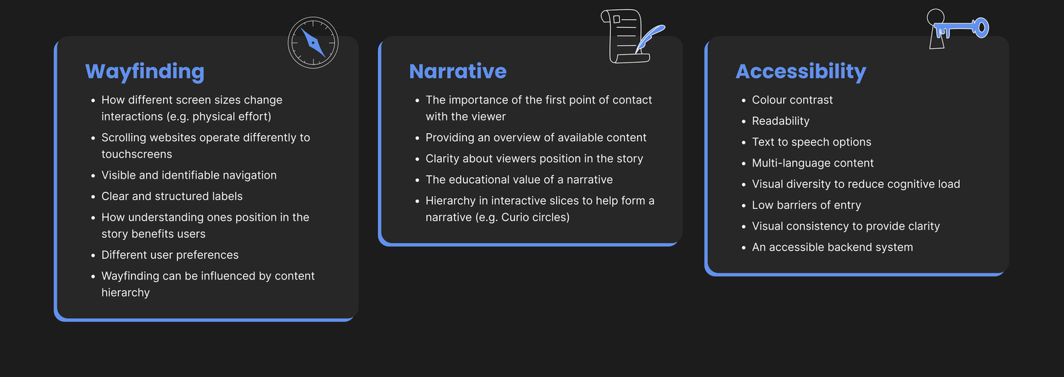
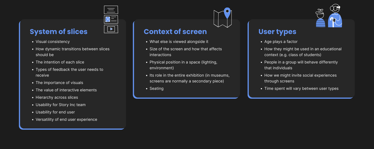
From their research they pinpointed some key considerations to move forward with…
Wayfinding, Narrative, Accessibility, a System of Slices, the Context of the Screen and User Types.
A System of Slices
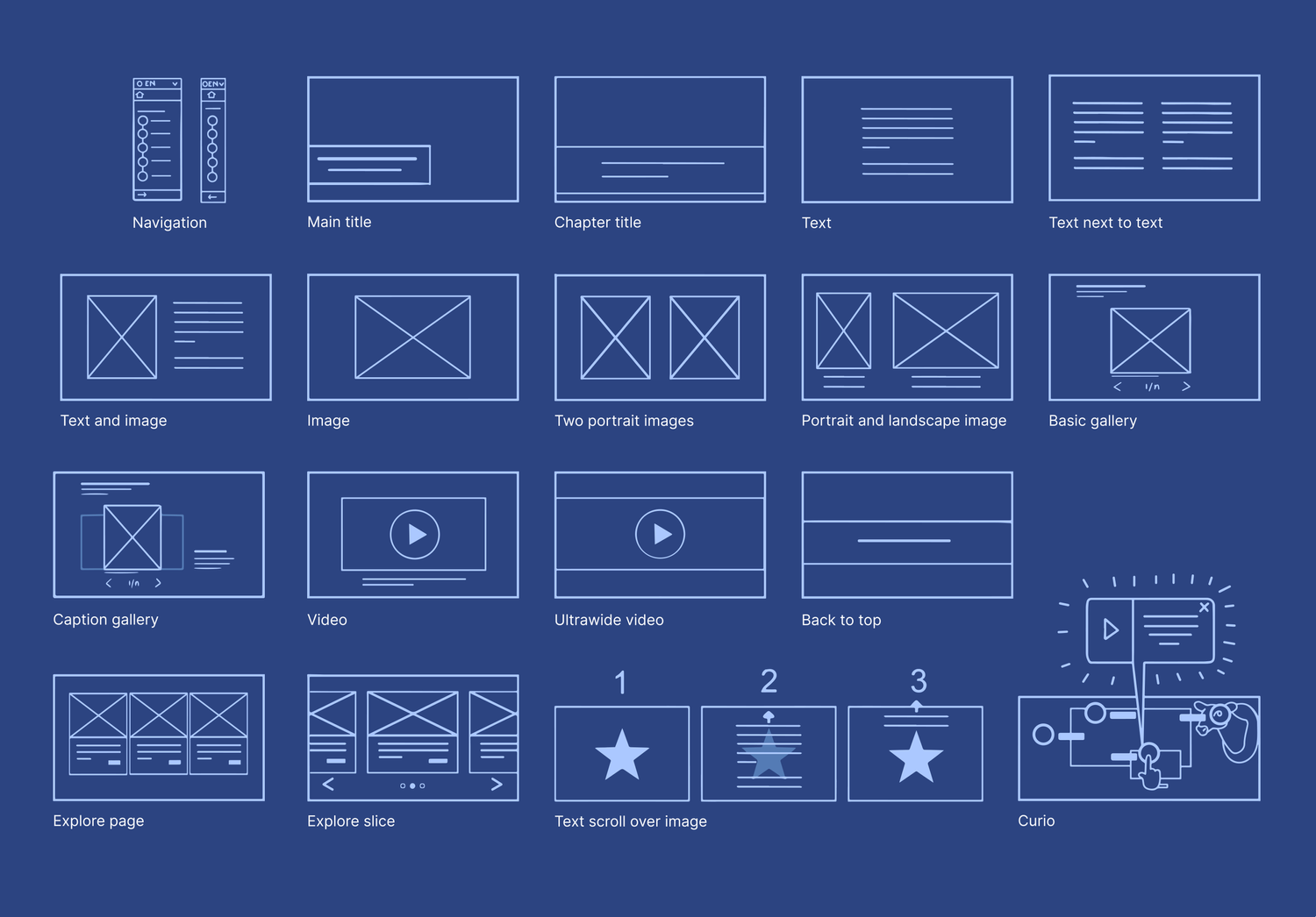
With all of this in mind, the Capstoners created a system of "slices" that can adapt to any museum or visitor experience project, and a user manual to ensure the quality of future whimbrels.
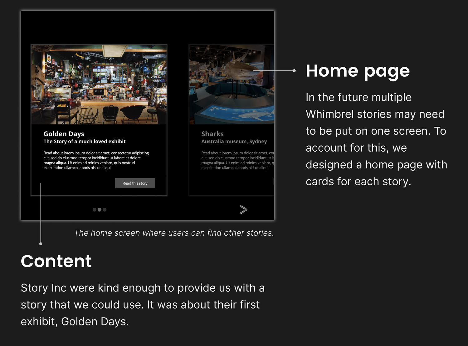
Finally to test out the system they forged their own whimbrel/scrollytelling about Story Inc’s founding moments in Golden Days. Check out their prototype here.
If anyone is looking for UX Designer’s these ones come highly recommended by us! Thank you Capstoners for your vital research, we hope to be using Scrollytelling in many future projects.
Alina Wahab (alinawahab98@gmail.com https://alinawillustrates.weebly.com/ )
Eva Zhou (eva@graciousgift.co.nz www.graciousgift.co.nz www.linkedin.com/eva-zhou-82624527 )
Clara Huppke (chuppke@gmx.de https://www.linkedin.com/in/clara-huppke-88310713a/ )
Kayla Palmer (palmerkayla.nz@gmail.com https://kayla-palmer.com )
Kyla Galela (kyla.galela@gmail.com https://www.linkedin.com/in/kyla-galela)


