User experience design
Over the past 20 years Story Inc has learned a lot about what makes a great user experience: multisensory and immersive for wide appeal; keeping things simple, consistent and intuitive; always considering the wider context, story, and visitor needs; making the experience not too short or too long... and so on. But we’ve never really documented what we've learned.
Enter a group of four talented Victoria University of Wellington Masters of UX Design students - Agnes Lo, Patricia Chua, Jacqui Khiu and Emily Bulkley. Working on their final Capstone Project for the intensive one-year programme, the team chose to work with us, focusing on the question, “how might we bring a user experience design lens to the creation of exhibition interactives?”
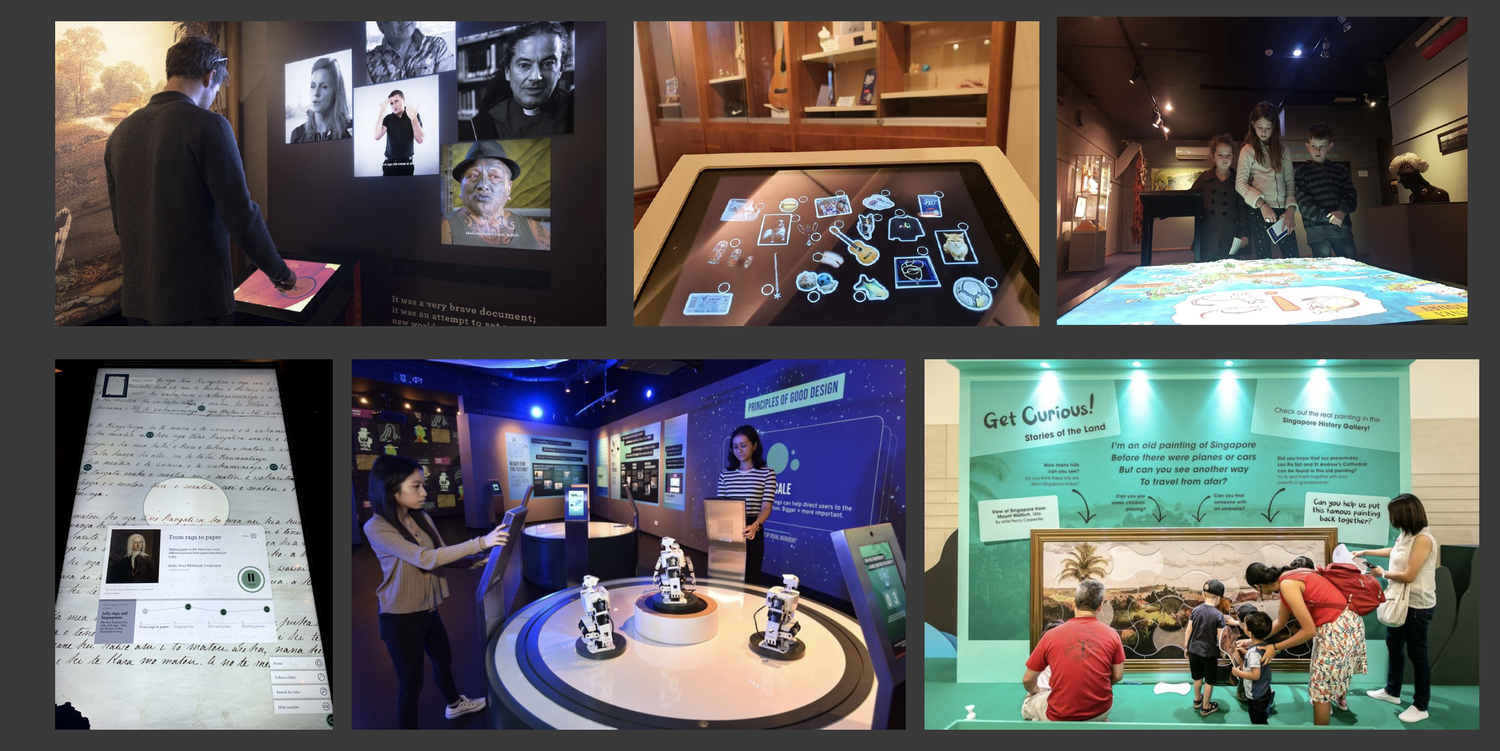
Capstone presentation slide: Story Inc digital interactives
This opportunity arrived at the perfect time for us at Story Inc. Not only is UX design becoming more and more central to our work, but we are also working to capture our collective knowledge and document our own processes more intensively.
“It’s important to design interactives and experiences that appeal to and can intuitively be used by a wide range of people,” says Briar Barry, Story Inc’s Senior Creative Producer. “UX techniques allow us to foresee problems and explore options early in the process.”
The students researched museum and visitor experience design, conducting interviews with our staff, visiting various institutions and undertaking secondary research and reading on the topic. Designing, organising and running User Research for three interactive concepts that are currently in development produced fascinating insights. Their findings have already led to adjustments in our approach to both the design and content for these interactives. "We learned just how much the principles of good UX design are actually baked into other forms of design too - spatial, graphic and so on.”says Emily Bulkley.
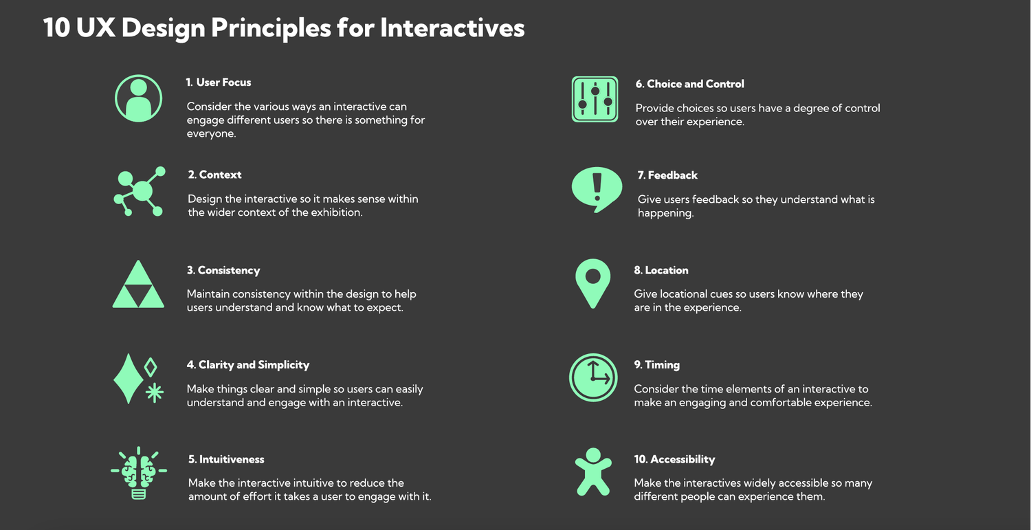
Capstone presentation slide: UX Design Principles for Interactives
As well as writing a User Research Report, the team created a fully interactive Figma site which distills all of their findings into a coherent set of Design Guidelines. Built so it can be updated, we have no doubt this will become an essential internal resource for us.
Figma site homepage
Everyone from Story Inc was blown away with the final product. Experience and Content Developer Kate Manson says, “Having this resource will be so useful for us across all future projects. Not only will we be able to check that we have considered every angle before moving too far down a design track, but we will also be able to explain ideas and the thinking behind them more clearly to clients.”
Agnes, Patricia, Jacqui and Emily are now on the hunt for graduate UX roles. If you, or someone you know of is looking to hire a UX graduate they come highly recommended by us.
They can be contacted at:
Top left: Patricia Chua: chua.patr@gmail.com
Top right: Agnes Lo: agnes.lo99056@gmail.com
Bottom left: Jacqui Khiu: jacquikhiu@gmail.com
Bottom right: Emily Bulkley: emi.bulkley@gmail.com


