VE vs UX: Visitor experience and user experience
Our brilliant resident UX designer Kate Berry is currently working on one of our top secret international projects. She sat down to explain UX design and shared her best tips for creating the perfect user experience.
To Kate, UX design is all about seeing things from the point of view of the user. As an artistic person, leaving biases and personal aesthetic preferences behind can be hard, but it's vital. User come in all ages and have a range of capabilities - so designs must be as easy, intuitive and fun as possible. Good UX design looks "obvious", but every part of it has actually had to be carefully thought through.
Local inspiration: The biodiversity wall and accompanying touchscreens at Te Papa's Te Taiao exhibition. Photo: Te Papa
Every project is unique. Kate says that the international project she is working on poses a particular challenge for her. Working halfway across the world from the space in which her designs will be implemented means she has to get creative with researching and testing her ideas. She has been frequenting Te Papa’s awesome natural history space, Te Taiao, to observe how visitors actually interact with the technology. This type of research is crucial to successful UX design.
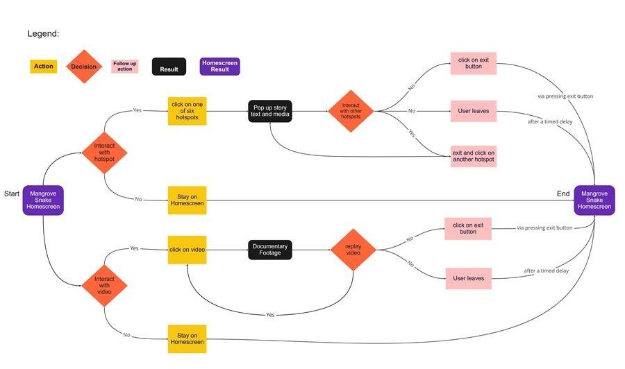
Apart from visiting sites and observing visitor interactions, Kate spends a lot of her time as UX designer creating flow diagrams, storyboards and wire-framing for the various exhibits that use different types of tech. Flow diagrams show all the possibilities of a user's journey when interacting with multimedia.
Pick and chose: A simple flow chart for a touchscreen interactive.
Kate describes wire-framing as the most basic structure for a design, consisting of just the key components an interactive needs in order to work successfully. Colour, sound and other graphics will come later in the design process, but Kate's job is to ensure that the foundations are as straightforward and accessible as possible.
One of Kate's wire-framing designs for an interactive puzzle game.
To make sure that her designs cater to a wide range of people, particularly children, Kate aims to make them as easy to understand as possible, with universal icons and images that are familiar to all age groups and cultures.
Next time you interact with technology - whether on an app on your phone, an interactive in a visitor experience, or even an everyday household item, look out for the UX design that went into it.


